Introduction
Welcome to the vibrant world of web design, where the right colors can make your site stand out and speak directly to the heart of your audience. Whether you’re a budding designer or a business owner looking to enhance your online presence, understanding color theory in web design is a fundamental step towards creating visually compelling and emotionally resonant websites. In this beginner’s guide, we’ll explore how color theory for websites can be the difference between a forgettable experience and a memorable one. From tapping into color psychology to improve website UX to mastering the best color scheme practices for modern websites, get ready to paint the digital canvas with confidence and creativity.
The Basics of Color Theory
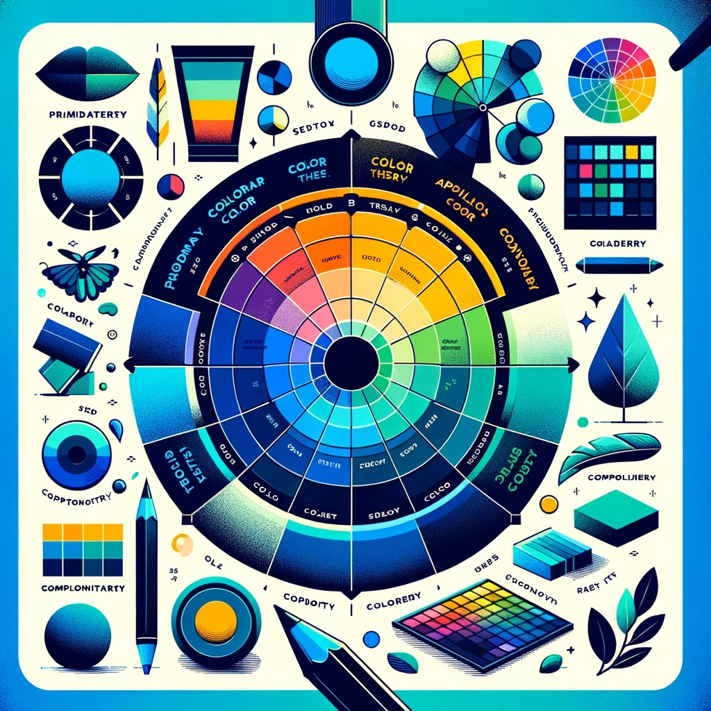
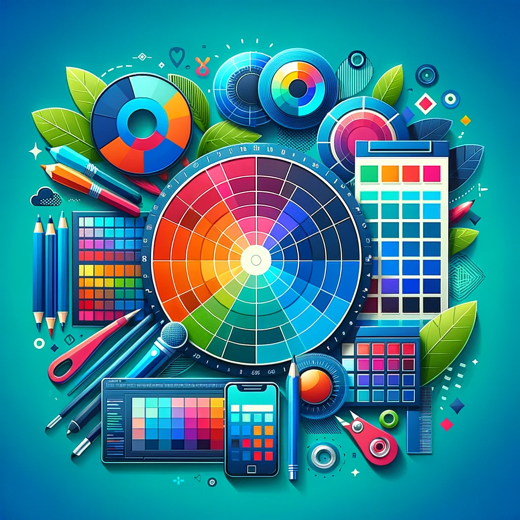
Diving into the fundamentals of color theory in web design unveils a spectrum of possibilities. At the heart of this visual science is the color wheel, a designer’s best friend, which maps out the relationships between hues. Primary colors – red, blue, and yellow – are the building blocks, combining to form secondary shades and beyond. When creating a color scheme for your website, consider harmonious combinations like analogous colors, which sit side by side on the wheel, or contrasting pairs known as complementary colors, positioned opposite each other. These relationships are not just about aesthetics; they’re a strategic toolkit for evoking the right mood and guiding user experience (UX) on your site. Grasping these principles paves the way for implementing the best color scheme practices for modern websites and harnessing the full potential of your online platform.

Color Psychology and Its Impact on Users
In the realm of color theory in web design, color psychology is pivotal in dictating the emotional response a user has to your site. Each hue in your palette carries weight, influencing perception and behaviors. Blue can evoke trust and security, often seen in banking sites, while orange can be energetic, ideal for call-to-action buttons. Utilizing color psychology to improve website UX involves more than aesthetic appeal; it’s about creating a user-centric experience that aligns with the psychological undercurrents of your audience. By understanding the emotional language of colors, designers can craft a site that not only looks good but feels right, making color a powerful tool in the user experience toolkit.
Selecting the Right Color Scheme for Your Website
The process of selecting the right color scheme is a critical step in color theory for websites. It sets the stage for your site’s visual communication and user interaction. Start by identifying the core message and emotion your brand embodies, then choose colors that convey these elements effectively. For instance, a health-related site might opt for calming greens, while a corporate site may prioritize professional blues. The key is consistency; ensure your colors complement each other and maintain harmony across pages. Embrace the best color scheme practices for modern websites by using tools like Adobe Color or Coolors.co to experiment with different palettes. Ultimately, your chosen colors should align with your brand’s identity and enhance the overall user experience, making your site not just a visual treat but a strategic asset.
Implementing Color Theory in Web Layouts
Implementing color theory in web design goes beyond choosing attractive hues; it’s about strategically integrating them into your web layout for maximum impact. This integration starts with a primary color that defines your brand, accompanied by secondary colors for balance and contrast. Pay attention to where and how you use these colors. For example, use brighter tones for call-to-action buttons to draw attention, while more subdued shades work well for background elements. Remember, consistency is key – ensure your colors are used uniformly across all pages to maintain a cohesive look. Embrace these best color scheme practices for modern websites, and watch as your site transforms into an engaging and intuitive user experience, where every color choice is purposeful and impactful.
Color Accessibility and Usability
Incorporating color theory in web design isn’t just about aesthetics; it’s also about ensuring accessibility and usability for all users. A critical aspect is color contrast, which affects readability, especially for those with visual impairments. Tools like the WebAIM Contrast Checker can help you test and adjust your color choices to meet accessibility standards. Additionally, avoid using color as the sole method of conveying information, as this can be challenging for color-blind users. By prioritizing these aspects of color usability, your website becomes more inclusive, ensuring a positive experience for a broader audience, aligning with the best color scheme practices for modern websites.
Conclusion
Understanding color theory in web design is crucial in crafting a website that not only looks great but also resonates with your audience. By applying the principles of color harmony, psychology, and accessibility, you can create an online space that’s both visually stunning and user-friendly. Embrace these insights to elevate your website’s design and ensure it stands out in the digital landscape.
Ready to apply color theory to your web design projects? Start experimenting with different palettes and witness the transformation of your website. If you’re looking for more guidance or professional assistance, reach out to us at Webmaster Solve. Our team of experts is here to help you navigate the world of color and create a website that’s not only visually appealing but also effective in engaging your audience. Contact us today to bring your vision to life with the power of color!


